iShowU Instant
Realtime screen recording for macOSWelcome to realtime screen recording like you've never seen before! iShowU Instant is the fastest, most feature filled realtime screen capture tool from shinywhitebox yet. It takes key features from both "Classic" and HD Pro, and merges them into a single product, making 'Instant' the only app you'll ever need to create recordings quickly.
All of the features you would expect are here, and probably some you don't! Record from any screen, enhance your microphone audio through the use of a dynamics processor, compressor and/or equaliser, add text and/or an overlay, enhance your recording with mouse and click visualization, trim front/back after recording, create time-lapse recordings, share to a wide range of online services, and more.
-
Built natively for Intel & Apple Silicon
-
Requires OS X 10.14.4 or later
-
Trim, Audio Dynamics / Compressor / EQ require Advanced Features, which can be purchased in-app at any time
Standard Features

A User Interface meant for you
Use an interface that you’re comfortable with. Want something simple? Use Basic mode. Want more power? Advanced mode gives access to all the options!
Customise your settings
Easily create presets for common editing tasks, or for different types of output. Give them custom names so you can easily recognize them.

Super Sharing
Share to YouTube, Vimeo and all other enabled OS X services. We’ve even included an animated GIF generator!

Clean and Simple
No need to tidy your desktop, we’ll do it for you. Instant can hide your desktop icons, and change your desktop picture to a solid color or other image.

Flexible Output
Produce Quicktime or MP4 at up to 60fps. Want to create a timelapse? You can set the frame rate as low as 1 frame per minute!

Better Camera Capture
Camera capture has been enhanced with the ability to show the camera either as a classic picture-in-picture, full screen, or completely hide it. Not only that, the transitions are animated in real time as you’re recording.

A time for everything
Start and stop recording when you want, using either durations or fixed absolute times.
Advanced Features
available as an in-app purchase, anytime
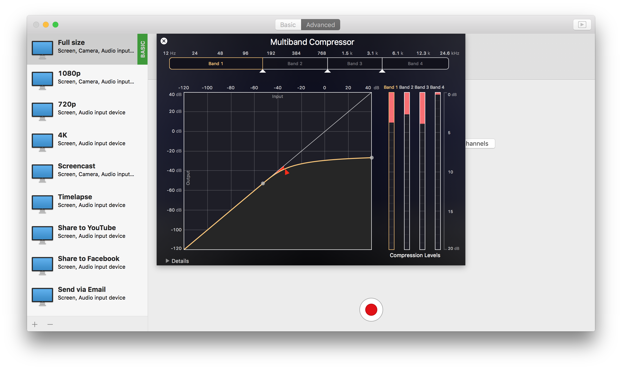
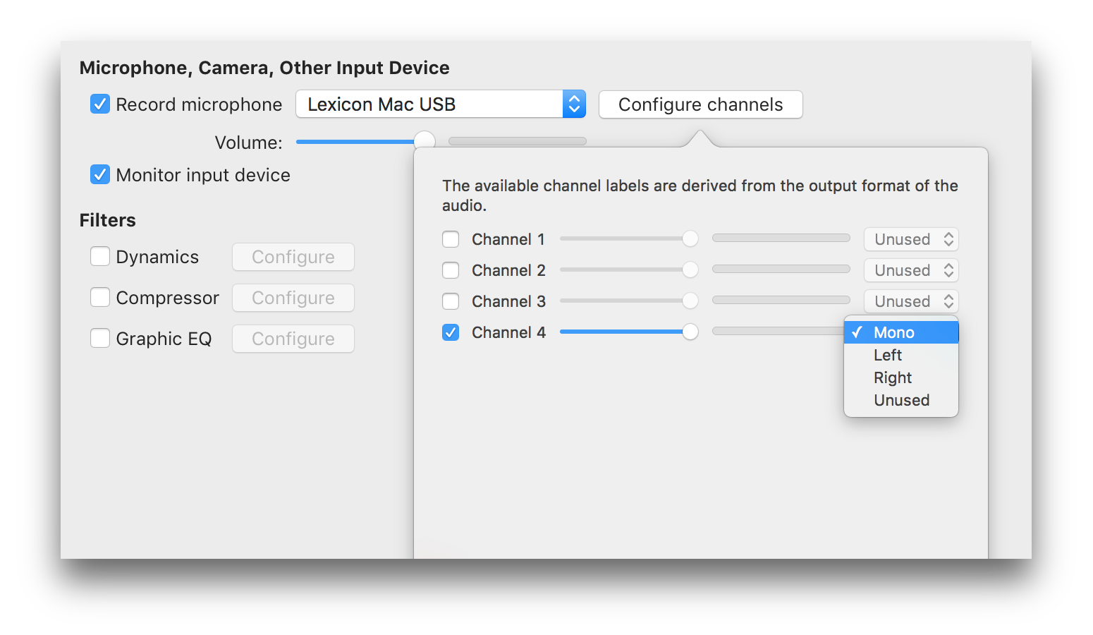
Audio Dynamics, Compressor and EQ
Get crisp and clean audio using the built in dynamics, compressor and equaliser. No need to clean audio afterwards. Got a 32 channel outboard device as input? No problem!

Text & Image Watermarks
Watermark your recordings with either text or an image (or both!), with control over opacity, size, position, rotation, borders, and reflection.

Prores built in
Retain maximum quality with a choice of either 422 or 4444 formats.

Full Visualization Control
More control over mouse & keypress visualization. Customize colors, enable single keypress visuals, modifier keypresses and click descriptions.
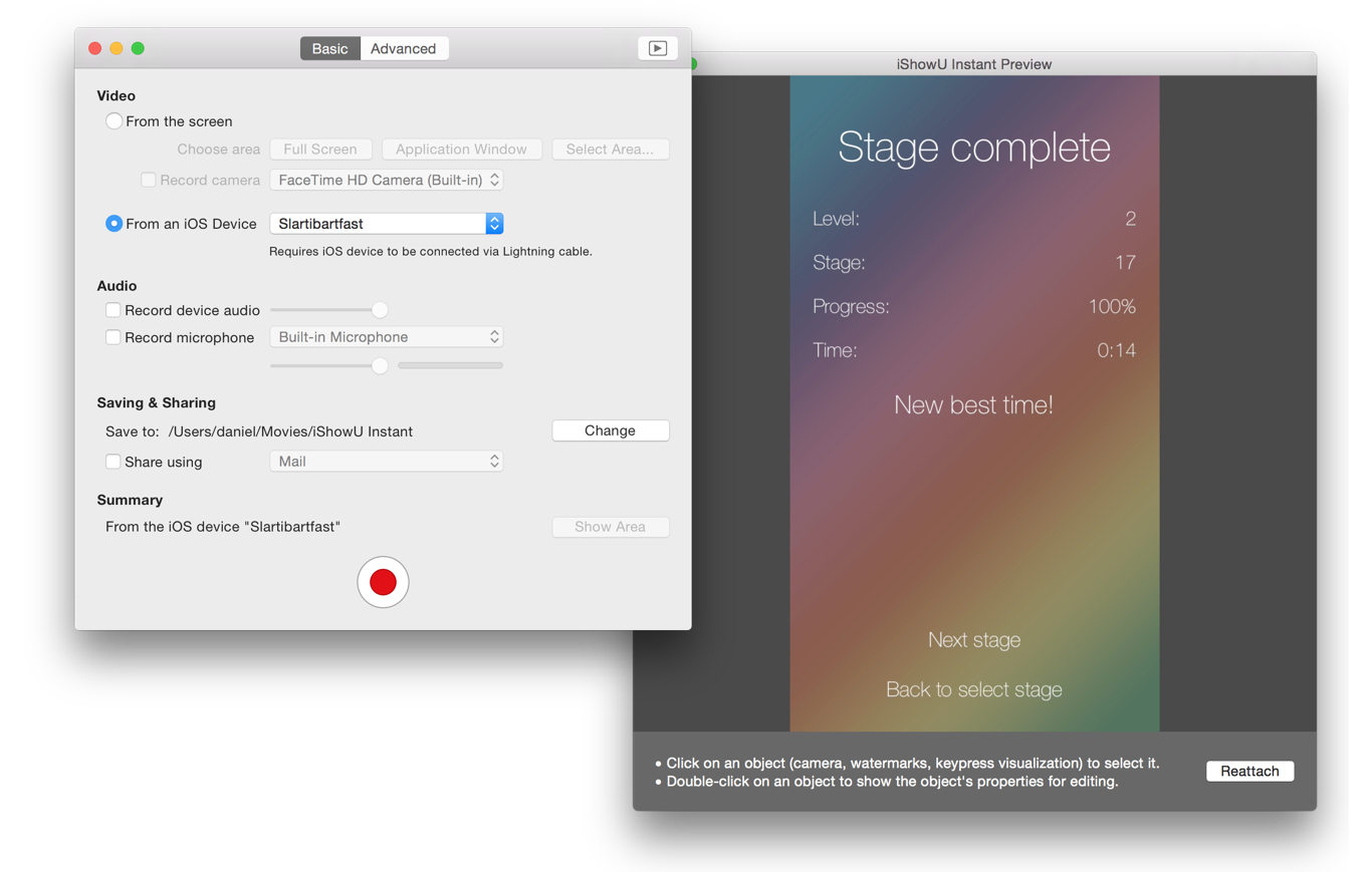
Record iOS devices
Create awesome looking demo videos from any iOS device.
Built-in Editing Essentials
Trim unwanted parts from the start & end and insert annotations or other graphic elements. Editing mode brings commonly used editing tools directly to iShowU.
Why iShowU Instant is better than iShowU v1 / HD & HD Pro
Want to know more, dig deeper? Read a more in depth response to one of our customers. Read Now| iShowU Studio 2 | iShowU Instant | iShowU Instant + Advanced Features | |
|---|---|---|---|
| Realtime capture | |||
| Live preview | |||
| Customizable recording presets | |||
| Detailed output format options | |||
| Output as ProRes 4444/422 | |||
| Animated GIF & PNG generation | |||
| Pattern-based output filename generation | |||
| Multichannel audio support | |||
| Audio filters (dynamics, compressor, EQ) | |||
| Scheduled recordings | |||
| User editable capture area | |||
| iOS device recording | 3 | 3 | |
| Record microphone audio | |||
| Record system audio | |||
| Record camera | |||
| Record mouse movement and clicks | 1 | ||
| Show mouse click ‘names’ (left/right/middle) | |||
| Show number of clicks | |||
| Record keystrokes | 2 | ||
| Show modifiers held | |||
| Option to force uppercase & remove duplicate keypresses | |||
| Show keypresses directly next to mouse cursor | |||
| Embed timestamp during recording | |||
| Edit after recording | |||
| Trim video before publication | |||
| Embed watermarks | |||
| Add shape objects (lines, arrows, etc.) | |||
| Transitions | |||
| Add custom text objects | |||
| Add additional media (pictures, movies, audio) | |||
| Crop unwanted areas before publication | |||
| Freeze-frame at any time, for any duration | |||
| Camera position modification (a.k.a pan/zoom) | |||
| Full screen editing interface | |||
| Share/export directly to iPod/iPad compatible formats | |||
| Export Selected Range | |||
| Upload directly to YouTube | |||
| Upload directly to Vimeo | |||
| Integration with OS X sharing |
- Mouse click descriptions and modifier keys only available with iShowU Instant Advanced Features.
- Keypresses following mouse cursor, only showing last key pressed, removing duplicate keys, and forcing keypresses to uppercase only available with iShowU Instant Advanced Features.
- Requires the phone be connected to your Mac with a lightning cable. The older 30 pin cable won’t work.
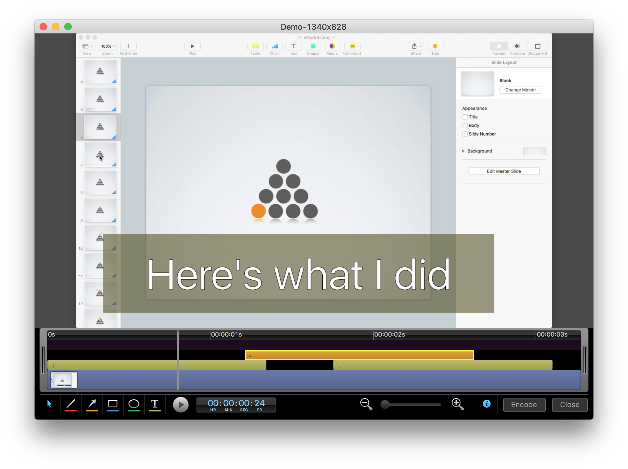
Demo Video
Screenshots